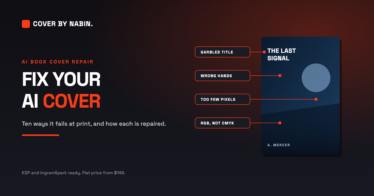
An AI image tool gave you a cover that looks convincing on your phone. Then you uploaded it, and something was wrong. The file was flagged. Or the proof came back soft. Or the title dissolved into nonsense the moment you zoomed in, and you noticed for the first time that the fingers on your protagonist's hand do not add up.
This guide is the whole job, start to finish. Every way an AI cover fails at print, why each one happens, how it is actually repaired rather than filtered, the spine and bleed maths worked out with real numbers, and what Amazon KDP, IngramSpark and the US Copyright Office require from you once the book is published. If you only read one section, read what the platforms require, because that is the part most authors discover last and it is the part that can take a book off sale.
One thing before we start. None of this is the model being bad at its job. It is the model doing exactly what it was built to do, which is predict pixels that look plausible. A book cover is not a picture. It is a manufactured object with a spine that has to match a page count, a trim line that moves by up to an eighth of an inch, a barcode zone that cannot be covered, and a thumbnail on a search results page that decides whether anyone ever reads your title.
Why an AI cover looks fine on screen and fails on paper
The gap between the two is not a matter of taste. It is measurable, and it comes from three transitions that happen at the same time when you press publish.
The first is pixels turning into ink. Your screen is self lit and resolves around 96 pixels per inch. A press lays down ink at 300 dots per inch and the paper absorbs the light rather than emitting it. The image you approved was optimised to look plausible on a screen at thumbnail size, which is a completely different problem from surviving a 300 DPI press run on coated stock.
The second is a square turning into a wrap. Generators produce a single centred image, almost always square. A paperback cover is a wide rectangle made of three parts: the back cover, the spine, and the front cover, with bleed beyond all of them. Nothing in a square generation reserves room for a fold, a hinge, or a barcode box, because the model has never seen one.
The third is a picture turning into a product. A cover has to carry a title that is legible at 150 pixels, a blurb that reads on a shelf, a spine that lines up with the page count you actually printed, and a name spelled the same way on the front and in the metadata. A picture has none of those obligations.
The resolution arithmetic, in one line
Divide the pixel width of your image by the width in inches it has to print at. That is your effective resolution. A typical 1024 pixel generation placed six inches wide comes out at 171 DPI. Stretched across a full wrap of roughly 12.9 inches it falls to 79 DPI. KDP asks for a minimum of 300 DPI and treats anything under 200 as low resolution, which is why the upload check catches it.
That is the whole reason a cover can look sharp in a browser and soft on paper. The file does not contain the information the press is asking for.
The ten ways an AI cover fails
These are the failures I find most often, in the order they tend to matter. The first eight are in the artwork itself. The last two are in the words that travel with it, because a cover is judged together with the blurb printed on the back and the copy around it. If you recognise three or more on your own file, it is not ready to publish.
01. Typography and lettering
Image models do not typeset. They predict pixels, so a letter is painted as a texture that resembles a letter rather than a glyph with a defined outline. There is no text object underneath the paint, which means there is nothing to edit, re-space, or correct.
- Misspelled or garbled titles, most often on short strings where the model has least context
- Pseudo-text that reads as words from across a room and dissolves into nonsense at 100 percent zoom
- Letters drawn inconsistently, so the title looks hand scribbled rather than set
- No font file, so no licence and no way to correct a typo without rebuilding the artwork
How it fails: a typo cannot be corrected, and the title is illegible on Amazon. This is the failure that most often forces a rebuild rather than a repair, because painted text has to be removed before real text can be set.
How it is fixed: the painted lettering is removed and the title is set again in real type, using a licensed font as an actual text object with proper kerning and tracking. Because it is live type, a typo becomes a five second correction rather than another rebuild, and the type can be scaled, re-spaced or re-coloured at any point.
02. Composition and layout
Generators produce one centred square with no concept of a book. They have never seen a spine, a hinge, a back cover or a barcode box, so none of that space is reserved. Everything you need to add later has to go somewhere, and there is nowhere left.
- A square generation cropped to a 6 by 9 portrait panel loses roughly a third of the image, often the head or the hands
- The focal subject sits dead centre, which on a wrap cover is the spine, so it gets split by the fold
- No space left for the author name, the subtitle, or a series line
- Art running straight through the spine hinge, where it cannot be seen and will not align
How it fails: the subject is bisected by the fold and the title has nowhere to sit, so it ends up crowded into a corner at a size that will not read.
How it is fixed: the composition is rebuilt for the actual panel. The subject is moved off the fold, the frame is extended deliberately rather than by a blind crop, and type zones are reserved before anything is placed. Where a crop would decapitate the subject, the artwork is rebuilt around it rather than squeezed.
03. Anatomy and physics
This is the best documented failure in generative imagery, and it runs much wider than hands. Models learn what a thing looks like, not how it works, so anything governed by a physical rule is a coin toss.
- Extra or missing fingers, or fingers that merge into each other and into objects
- Asymmetric or misaligned eyes, teeth fused into a single band, jewellery melting into skin
- Weapons and blades that bend or taper, straps that pass through the body
- Reflections that do not match, shadows pointing away from the light, two vanishing points in one scene
How it fails: printing at 300 DPI makes every one of these more visible than it was on screen. A hand that looked fine at thumbnail size becomes unmistakably wrong at print size, and it is usually the first thing a reader notices.
How it is fixed: by hand, at pixel level. Extra fingers are removed, eyes are realigned, teeth are separated, blades are straightened, and shadows are matched to a single light source. This is the part that cannot be automated. An upscaler makes a six fingered hand sharper, not correct.
04. Resolution and print quality
This is the one that gets files rejected. Most consumer generators output 1024 by 1024 pixels, or about 2K at best. KDP requires a minimum of 300 DPI and treats anything under 200 DPI as low resolution.
- A 1024 pixel image placed six inches wide works out at about 171 DPI, below even the low resolution floor
- Stretched across a full wrap it falls to roughly 79 DPI
- Upscaling invents texture rather than recovering detail, so skin turns plastic and edges turn crunchy
- Raising the DPI number in an editor changes the label, not the image
How it fails: the cover prints soft and mushy, or the upload is flagged or refused. Note that changing the resolution field in an editor to 300 does not add a single pixel of detail. It only changes what the file claims about itself.
How it is fixed: the file is rebuilt at print resolution from the largest source available, with the artwork repaired before it is scaled so that defects are not amplified along with everything else. Where the source genuinely lacks the detail, you are told honestly and refunded before any work begins, and the realistic options are to regenerate at a higher resolution or to build a new cover. That promise is on the service page.
05. Colour and reproduction
A screen emits light and adds colour. A press lays down ink and absorbs it. The printable gamut is materially smaller, and the missing region is exactly the bright saturated cyans, greens and violets that AI generators favour.
- Neon gradients and vivid magenta to cyan blends print duller, muddier and often banded
- Pure black at zero red, green and blue is a screen black, containing no ink density, and prints as a washed dark grey
- Rich black built for large solids must never be used on small text, where it causes a registration halo
- Out of gamut warnings are the software telling you a colour will shift, and ignoring them means finding out on the proof
How it fails: the dark cover loses all its detail and no longer matches the marketing images on your website, your ads and your social posts, so the book looks like a different product depending on where a reader finds it.
How it is fixed: the file is converted to CMYK against a deliberate profile and graded for ink rather than for a screen. Blacks are rebuilt properly, with rich black for large solids and a single black for text, and a proof is produced so that what you approve is what prints.
06. File format and print mechanics
A generator gives you a picture of a cover. A printer needs a page definition file with a trim box, a bleed box and embedded fonts. These are different kinds of object, and the difference is where a lot of rejected uploads come from.
- No bleed, so a white sliver appears wherever the trim lands a fraction wide
- Live transparency, which prints with missing or distorted content unless it is flattened
- JPEG ringing and blocking around hard edges, invisible on screen and obvious on paper
- Banding across smooth skies and vignettes once compressed and printed
- No embedded fonts, no crop marks and no vector output, because there is no vector underneath
How it fails: the upload is rejected, or a white edge shows on the finished book where the trim cut inside your artwork.
How it is fixed: the file is rebuilt as a real print file. Bleed is added on the outside edges, transparency is flattened, fonts are embedded, crop marks and template text are removed, and the whole thing is exported as a single PDF containing the back cover, the spine and the front cover as one page. The exact numbers are in the specification section below.
07. Platform rules and legal exposure
The risk here is not technical, and it does not show up until after you have published. It is worth reading the rules section in full, because the three platforms involved do not ask the same thing of you.
- KDP requires you to declare AI generated content at publishing time, and states plainly that this includes cover art
- US Copyright Office guidance: material generated purely from a prompt is not protected by copyright, because the expressive choices were made by the technology
- A cover you cannot register is a cover you cannot defend if another author copies it
- Models trained on scraped images can and do reproduce protected characters, logos and likenesses, and the publisher carries the liability
How it fails: a title is removed from sale, or you hold artwork you cannot protect. IngramSpark goes further than KDP here, and names content created solely using generative AI among the material it may refuse.
How it is fixed: partly by the repair itself and partly by what you declare. Substantial human rework is exactly the factor IngramSpark's guidelines look for and the factor the Copyright Office names as protectable, so the repair is not only cosmetic. The KDP declaration obligation remains regardless, and it is a checkbox rather than a penalty.
08. The thumbnail test
The most commercially damaging failure, and the one authors notice last. Amazon shows your cover at roughly 150 pixels tall in search results, next to dozens of competitors, and that is the image that decides whether anyone ever reads your blurb.
- Dark, low contrast AI art collapses into a grey smudge at that size
- Thin or decorative title type disappears entirely
- Busy detail that looked impressive full size becomes visual noise
- Series covers do not repeat, because the generator cannot hold a style across runs
How it fails: the cover is unreadable in search, so nobody clicks, whatever the book is worth. This is the failure that costs the most money and the one that no amount of print correctness will rescue.
How it is fixed: the contrast and value structure are rebuilt for small size, the title weight and size are set to survive at 150 pixels, and a series template is locked so that book two matches book one. You can check your own cover for free with the thumbnail audit tool.
09. The blurb and the back cover copy
An AI cover arrives as a single flat image, so there is no back cover and no blurb to go with it. Most authors write one in a hurry, or ask a chatbot for one, and paste it in without reading it aloud. The blurb is the second biggest lever you have after the cover, because it is what converts the click into the sale.
- It summarises the plot instead of selling the hook, so it reads like a synopsis rather than an invitation
- It opens with filler such as "In a world where" or "Nothing is as it seems", which signals a book written by a template
- It runs far too long for the back cover panel, so it gets shrunk to a size nobody can read on a shelf
- The first two lines carry no genre signal, so a browsing reader cannot tell what kind of book this is
- It contradicts the book: the wrong tense, the wrong point of view, or a character named differently inside
- The author bio is a career history rather than one line of why you are worth reading
How it fails: the cover earns the click and the blurb loses the sale, on the same page.
How it is fixed: the blurb is edited rather than generated. The hook is tightened, the filler is cut, the first two lines are made to carry a genre signal, and the result is set at a size that actually reads on a shelf. The bio is reduced to a single line of why you are worth reading.
10. Typos, spelling and grammar
This is the part nobody checks, because it is the part that was never generated for you. The image tool painted some text as texture and got the letters subtly wrong. The rest of the words you typed yourself, at the end of a long day. Both end up in front of a reader at the same time.
- Misspelled text baked into the artwork, such as a tagline, a series name or a fake publisher line, with letterforms that are subtly wrong
- Your name spelled one way on the cover and another way on the title page, which also breaks the search for your own book
- Title case and subtitle case applied inconsistently, so the same words are capitalised two different ways
- British and American spelling mixed inside one paragraph of the blurb
- Straight quotes in one place and curly quotes in another, doubled punctuation, or a missing full stop at the end of the blurb
- A tagline that repeats or contradicts the subtitle printed directly above it
How it fails: a reader spots a typo in the first thing they ever see of your book, and assumes the inside is the same. They are often right to.
How it is fixed: a full proofread pass over the title, the subtitle, the tagline, the blurb and the bio, plus correction of the text the generator painted into the artwork itself. The two halves of that job have to happen together, because they are read together.
Is your cover in that list?
If you recognised three or more of those ten, the file is not ready to publish. Send it and I will audit it against the print specifications before any work begins, and tell you honestly whether it can be rescued at the size you have.
Fix My AI Cover Run the Free Thumbnail AuditA real one, taken apart
Here is a rescue from this studio, and it is worth studying because the artwork did not change at all. The image, the mood, the figure and the road are identical in both versions. Every difference you can see is typography and composition, which is exactly the layer a generator does not design.
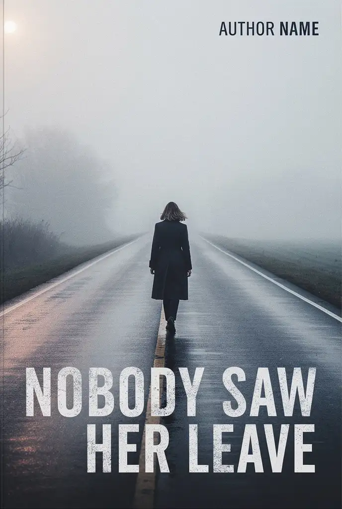 Before
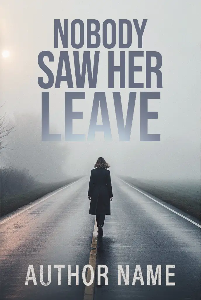 After
After
What the generator got wrong
As an image this is genuinely atmospheric, and that is the trap. It looks finished on a phone screen. As a cover it fails in ways that only show up when you measure it, and every number below is taken from the two files above.
- The title was set on the busiest surface in the picture. It sits over the wet road, where the centre line and the reflections run straight through the letters. Measured across the type, the background luminance swings from 43 to 144, a spread of 101 levels. Type needs a quiet field to sit on, and this one is the noisiest region in the frame.
- The author name was the least legible element on the cover. 27 pixels of cap height on a 1024 pixel cover, set in near black on pale fog, tucked into the top right corner. Show that cover at 100 pixels wide, which is how a search result shows it, and the name is 2.6 pixels tall. It is not a name at that size. It is a smudge.
- Two textures were fighting for the same job. The title face is distressed, eroded at the edges, and it is laid over a wet streaked road. Rough type on a rough surface means the letters stop reading as letters and start reading as more road.
- The title and the author line were set in two unrelated faces. A distressed condensed for the title, a plain letterspaced grotesque for the name. Nothing ties the two together, so the cover reads as two separate designs stacked on one picture.
- The words were the brightest thing in the frame. The title is near white, brighter than the fog and brighter than anything on the figure. The eye lands on the type first and on the subject second, which is backwards for a cover whose subject is the whole point.
- The reading order ran backwards. The title is the last thing at the bottom, below the figure and below the road. A reader scans down, meets the subject, and only then meets the title.
What the repair changed
- The title moved off the road and into the fog. The upper third of this image is the flattest region in it. Behind the type the luminance now swings by 28 levels instead of 101, so the letters sit on a field that does not compete with them.
- The stack was rebuilt from two lines into three. Three shorter lines make a narrower block, and the block now runs to 48 percent of the cover height instead of 21. At 100 pixels wide, one line of the title went from roughly 10 pixels tall to roughly 16.
- The distress was demoted from the title to the author line. The title now uses a clean geometric grotesque, where the counters stay open and the strokes stay even, so the words hold their shape at any size. The eroded texture was not thrown away. It was moved to the line where legibility costs the least.
- The author line was promoted from a corner mark to a real line. It moved to the bottom, grew from 27 pixels of cap height to 72, and changed from black on pale fog to white on the dark road. At 100 pixels wide that is the difference between 2.6 pixels and 7.0 pixels, which is the difference between a smudge and a name.
- The title colour was pulled out of the artwork. It is a cool slate sampled from the mist rather than pure white, so it reads as part of the picture instead of something laid on top of it.
- The last word dissolves into the mist. LEAVE is set lighter than the two lines above it, so it fades into the fog as it lands. The type is carrying the meaning of the title: she leaves, and the mist takes her.
The repair is not free of trade offs, and the one it makes is worth being straight about. The title's contrast against its background is lower than white on a road was, and letting the last line fade is a deliberate bet on atmosphere over maximum punch. What that buys is a title block that more than doubled in height, on a field that does not fight it, and an author line that can actually be read at the size most covers are seen.
Notice what is missing from both lists. Nothing here is a retouching job. The generator produced a striking image and that image is still there, untouched. What it could not do is design type into the picture, because it is composing pixels rather than laying out a page. It has no idea that a cover needs an empty region reserved for words, or that the smallest line on it still has to survive a search result. That last step is the whole difference between an image and a cover, and it is the step the repair service exists to take.
The print specification, worked out
You do not need to memorise this, but you do need to know it exists, because it is the difference between a file that uploads and a file that bounces. These are KDP's published paperback requirements, and IngramSpark's are close enough that the same file usually satisfies both.
Bleed: the eighth of an inch that ruins covers
All covers have bleed. Your background and artwork must extend 0.125 inches (3.2 mm) beyond the final trim line on the top, bottom and outside edges. Books are trimmed after printing, and the trim lands slightly differently on every copy, so artwork that stops exactly at the trim line leaves a white sliver on some copies and not others.
The spine, which is not a guess
The spine width is a function of your page count and your paper stock, and it is the number most authors get wrong. Use these constants:
| Paper type | Thickness per page |
|---|---|
| Black and white, white paper | 0.002252 in |
| Black and white, cream paper | 0.0025 in |
| Premium colour | 0.002347 in |
| Standard colour | 0.002252 in |
Keep three decimal places and only round at the very end. A spine that is out by twenty thousandths of an inch is a spine that puts your title onto the fold, and there is no way to fix that after the book is printed.
The rules that catch people out
- Spine text needs at least 79 pages. Below that the spine is too narrow to print on reliably, and KDP will reject a cover that carries it.
- Keep spine text 0.0625 inches from each fold. Every book binds slightly differently, so allow for variance on either side.
- Keep all text 0.125 inches inside the trim. Text closer than that can be trimmed off, and no front or back cover text should reach into the spine area at all.
- Reserve the barcode zone on the back cover and leave it clear. If you do not supply a barcode, KDP places one there automatically.
- Images at 300 DPI minimum, CMYK, flattened to one layer, placed at 100 percent rather than scaled up inside the document.
- Export as a single PDF containing the back cover, spine and front cover as one page, with fonts embedded and transparency flattened.
If you want the full dimension treatment, including hardback case laminate, the hinge, and a worked example for a short book, that is covered in the KDP cover size guide. There is also a free template calculator that does the arithmetic for your exact trim size and page count.
What KDP, IngramSpark and copyright actually require
This is the section most AI cover guides skip, and it is the one with real consequences. The three bodies below are not asking the same question, and reading them together explains why a cover can be fine for one channel and refused by another.
KDP: disclose it, and cover art counts
KDP requires you to inform them of AI generated content when you publish a new book or republish an existing one. Their content guidelines state that this applies to text, images and translations, and then make the point that matters here: AI generated images include cover and interior images and artwork.
They also draw a line between two categories, and the distinction decides whether you have to say anything at all:
| Category | What it means | Disclosure |
|---|---|---|
| AI generated | An AI based tool created the actual content, even if you applied substantial edits afterwards | Required |
| AI assisted | You created the content and used AI to edit, refine, error check or improve it, or to brainstorm ideas you then made yourself | Not required |
Read that first row again, because it is the sentence most authors miss. Repairing an AI generated cover does not move it into the assisted category. The artwork was still created by the tool, so it is still AI generated, and the declaration is still yours to make. The disclosure is a checkbox at publishing time and it costs you nothing. The risk sits entirely in not disclosing.
Enforcement is worth understanding too. KDP describes using machine learning, automation and dedicated human reviewers, and says it will reject or remove content that does not follow the guidelines, may request additional information before a book goes on sale, and lets you appeal a removal. The guidelines apply to book content, including title, cover art, and product description.
IngramSpark: the bar is how much of it is human
IngramSpark, through Lightning Source, takes a harder line, and this is where a raw AI cover can put an entire book at risk rather than just a checkbox.
Their content guidelines list, among the material that may not be accepted, content created using automated means, including but not limited to content generated using artificial intelligence or mass produced processes. They also refuse content that mirrors or mimics popular titles, including similar covers, and content that is misleading, including inaccurate cover art.
Then they get specific about generative AI, and the split is the useful part:
| Acceptable | Unacceptable |
|---|---|
| Generative AI used only in an assistive way, such as spell check or proofing | Works created solely using generative AI |
| Content or images where the majority of the work was created using human creativity and contribution | Works that violate intellectual property or copyright law |
| Works using generative AI but with significant and material human editorial review and contribution, with proper attribution |
Their guidelines also state that proper attribution of creation must accompany all works. So on IngramSpark the question is not whether AI touched your cover. It is how much of the finished cover is human, and whether you have said so.
This is the reason the repair is not only cosmetic. On KDP, disclosure is a checkbox and the artwork's origin is unchanged. On IngramSpark, substantial human rework is the difference between a cover they name as unacceptable and one they can accept. The same job does different work on the two channels.
Copyright: what you can and cannot own
The US Copyright Office published its conclusions on the copyrightability of generative AI output in January 2025, and they are more nuanced than the headlines suggested. The Office concluded that the output of generative AI can be protected by copyright only where a human author has determined sufficient expressive elements. That can include a situation where a human authored work is perceptible in the output, or where a human makes creative arrangements or modifications of the output. It does not include the mere provision of prompts.
The Office also confirmed two things that help an author in your position. Using AI to assist in the process of creation does not bar copyrightability, and including AI generated material in a larger human generated work does not bar it either.
Why this matters practically: a cover you cannot register is a cover you cannot defend. If another author lifts your artwork, your remedy depends on there being protectable human authorship in it. A prompt typed into a generator gives you very little to stand on. Human creative arrangement and modification is the thing the Office names as protectable, which is precisely what a serious repair adds.
I am a cover designer, not your lawyer. The summaries above are drawn from the published policies and guidance, and I have linked the sources so you can read them yourself. Platform policies change, and the obligation to comply with them is yours as the publisher.
The 2026 KDP title limit changed the maths
One more rule changed five days before this was written, and it changes the strategy around AI covers more than any technical point in this guide.
On 21 September 2026, KDP reduced its title creation limit to two new titles per format per week. The formats covered are Kindle, paperback and hardcover, and each carries its own allowance of two, which resets every Sunday at midnight UTC. Publishing the same book in all three formats uses one slot from each counter rather than three from one, so the practical ceiling is two complete books a week, or roughly a hundred a year.
| Period | Limit |
|---|---|
| September 2023 to October 2025 | 3 titles per day |
| October 2025 to September 2026 | 10 per format per week |
| From 21 September 2026 | 2 per format per week |
Three details matter more than the headline number. The limit applies to creating a title, not publishing one, so a draft started in August and published in November never touches the current week's allowance. Existing and published titles are unaffected. And the exception route is gone: KDP's help page used to invite publishers expecting to create a large number of titles to contact them about an exception, and that sentence was removed at the same time as the number dropped.
What this means for an AI cover is simple. Volume publishing as a strategy no longer works, so each individual book has to earn more than it used to. And a book removed for poor print quality or a content policy breach costs you twice: the title is gone, and the slot you spent creating it is gone with it. Getting the cover right before you upload is now a cheaper decision than it has ever been.
Audit your own file before you pay anyone
You can run most of this in ten minutes, and it will tell you whether your file is a repair job or a rebuild. Do it at full size, on a large screen, not on a phone.
- Zoom to 100 percent and look at the hands, eyes and teeth first. Then the jewellery, the straps, the weapons, and the shadows. Check that every shadow points away from the same light source.
- Measure the pixel dimensions and divide the width by the number of inches it has to print across. Under 300 is a problem. Under 200 is a rejection.
- Check the colour mode. If it is RGB, the colours will shift on press, and the brightest ones will shift most.
- Shrink the whole cover to 150 pixels tall and look at it again. If you cannot read the title, neither can a reader scrolling Amazon.
- Compare the title on the cover with the title in your book metadata, letter for letter, including the subtitle and your own name.
- Read the blurb aloud. Anything you stumble over, a reader will too, and anything that sounds like a synopsis is not selling.
- Check for transparency and layers. If the file has live transparency or unflattened layers, it can print with missing content.
The fastest single test: put your cover next to five covers from the top of your genre's Amazon bestseller list, shrunk to the same 150 pixel height, and look at them together. You will know within three seconds whether yours competes. That comparison is free and it is more honest than any checklist.
How the repair actually works
Six steps, one flat price per package, and you approve a proof before anything is final.
- You send the file and choose your package. Upload the raw generation, pick the package that matches what you need, and tell me the trim size, page count and where you are publishing. If you are unsure about any of it, say so and I will work it out.
- You pay the flat price. The package price is paid through PayPal when the form is in, and the work starts as soon as it clears. No subscription, no add-on charges later, and nothing charged beyond the package you chose.
- I audit the file against the specification. I open it, measure it, check the resolution and the colour space, and identify every defect that will show up on press or on Amazon. If it turns out the file cannot be rescued at the size you sent, I tell you straight away rather than deliver something that will not hold up.
- The artwork is repaired by hand. Every artifact is corrected rather than filtered: hands, eyes, edges, reflections, impossible geometry. Then the file is rebuilt at print resolution and colour graded for ink rather than for a screen.
- The typography, the wrap and the words are built. The title is set in real type rather than painted, so it can be corrected, kerned and licensed. The spine is calculated from your page count and paper stock, the back cover is designed, the barcode zone is placed and kept clear, and the blurb is edited and set at a size that reads on a shelf. I also proofread the title, subtitle, tagline, blurb and bio, and correct any text the AI painted into the artwork itself.
- You approve the proof, then the files are yours. You see a watermarked proof first. Once you approve it, the watermarks come off and you receive the print-ready PDF, the ebook cover file, and everything the printer needs.
The honest limit: I cannot make a 1024 pixel generation genuinely sharp at print size, and I will not pretend otherwise. If your image turns out to be too small to work with, I will tell you and refund you before any work begins. The options at that point are to regenerate at a higher resolution or to build a new cover.
Fix it, regenerate it, or start over?
Not every AI cover should be repaired, and a designer who tells you otherwise is selling rather than advising. Here is the honest decision framework.
| Situation | The right call |
|---|---|
| The composition and mood are right, and the source has enough pixels for the final size | Repair it. You keep the cover you chose and the craft gets fixed. |
| The source is too small, but you still have the prompt or the seed | Regenerate at a higher resolution first, then repair. Expect a different image, since these tools are not deterministic. |
| The concept itself is the problem, or you need a series that holds together | Commission a cover instead. Repair fixes craft, not ideas. |
| You want a finished, exclusive design today and the genre matters more than the artwork being yours | Buy a premade cover. The design already exists, so it is cheaper and faster than a commission. |
The test I use is simple. Cover the title up. If you can still tell what genre the book is, the concept is working and it is worth repairing. If you cannot, the problem is upstream of the artwork and no amount of hand repair will fix it.
Keep the cover you chose
Repair the artwork, set real typography, calculate the spine, design the back cover and deliver a print-ready file. From $149, first proof in three business days.
Fix My AI CoverOr commission something new
If the concept is the problem rather than the craft, a custom cover built from your brief, or a premade design sold to one author only.
Order a Custom CoverWhat it costs
One flat price per package. No hidden fees, and you approve the proof before anything is final.
| Package | Price | What you get |
|---|---|---|
| Front Cover Rescue | $149 | Ebook ready. Hand repair of every artifact, rebuilt at true 300 DPI, colour graded for print, title and author name set in licensed type, front cover file for ebook. |
| The Print Wrap | $249 | Everything in Front Cover Rescue, plus the spine calculated from your page count and paper stock, a full back cover design with the blurb typeset, the barcode zone placed and left clear, and a print-ready paperback PDF. |
| The Complete Publishing Bundle | $299 | Everything in The Print Wrap, plus the hardback jacket built to the hardcover spine width, the audiobook cover, and a set of 3D mockups for your launch and your ads. |
Revisions are included until you approve the proof, and within the scope you agreed there is no revision limit, because a cover you are not happy with is not a finished cover. Your first proof arrives within three business days. If the file turns out to be unusable at the size you sent, you are refunded before any work begins.
Frequently asked questions
Why does my AI book cover look blurry when I upload it to KDP?
Because the file was made for a screen, not for ink. A 1024 pixel generation placed across a six inch cover works out at about 171 DPI, and stretched across a full wrap it falls to roughly 79 DPI. KDP asks for a minimum of 300 DPI and treats anything under 200 as low resolution, so the upload check flags it or the printed book comes back soft.
What resolution does a book cover need to be?
300 DPI at the final printed size. Work backwards from the size you need: a six by nine inch front cover alone needs about 1800 by 2700 pixels, and a full wrap needs the entire width at that density, which is roughly 3878 by 2775 pixels for a 300 page paperback. Upscaling to reach the number does not create the detail, it only invents texture.
Can I just upscale my AI cover to 300 DPI?
You can change the number, but you cannot add information that was never captured. Upscalers invent plausible texture, so skin turns plastic, fine fabric turns into noise and edges turn crunchy. It also makes existing defects sharper: a six fingered hand upscales to a crisp six fingered hand. Upscaling is useful as one step inside a repair, never as the repair itself.
Do I have to tell KDP that my cover is AI generated?
If the image was created by an AI tool, yes. KDP requires you to declare AI generated content when you publish or republish, and their guidelines state that this includes cover and interior images and artwork. Their definition catches a cover that was generated by AI and then edited, so repairing it does not remove the obligation. Disclosing is a checkbox at publishing time; the risk sits in not disclosing.
Can I copyright an AI generated book cover?
Not the raw output. The US Copyright Office concluded in January 2025 that generative output can be protected only where a human author has determined sufficient expressive elements. That can include a human making creative arrangements or modifications to the output, but not the mere provision of prompts. Human authored work perceptible in the output, and AI material inside a larger human generated work, are both still protectable. It is worth reading their guidance directly rather than relying on a summary.
Will IngramSpark accept an AI generated cover?
It depends on how much of the final cover is human. IngramSpark's content guidelines list content created using automated means, including content generated using artificial intelligence, among the material that may not be accepted. Their generative AI guidelines accept images where the majority of the work is human, or where there has been significant and material human editorial review and contribution with proper attribution. A cover created solely by a generator is the case they name as unacceptable.
My AI cover is 1024 by 1024. Is it usable at all?
Sometimes, and you should be told honestly rather than sold a fix that cannot hold up. A 1024 pixel image cannot be made genuinely sharp at print size, because the detail was never captured. If it is the only source you have, the realistic options are to regenerate at a higher resolution or to build a new cover. A repair can still help where the final use is small, such as an ebook thumbnail, but it will not carry a print wrap.
Why does my AI cover have strange hands, eyes and teeth?
Because the model predicts what looks plausible rather than what is anatomically true. Hands are the best documented case, but at full size you also find misaligned eyes, teeth fused into a single band, jewellery melting into skin, straps passing through a body, shadows pointing away from the light, and two vanishing points in one scene. Printing at 300 DPI makes every one of them more visible than it was on screen.
Can you fix a spelling mistake that is baked into the artwork?
Yes, and it is one of the more common jobs. Text painted by a generator is a texture, not a text object, so there is nothing to edit. The affected area is rebuilt and the words are set again in real type, which is also why the corrected version stays correctable. The same pass proofreads the title, subtitle, tagline, blurb and bio.
Does fixing my AI cover make it human made?
It makes the craft human. The composition, the palette and the mood stay yours, and the defects, the resolution, the colour for ink and the typography are all corrected by hand. What it does not do is change where the artwork came from, so the KDP declaration obligation stays. On IngramSpark, where the bar is how much of the final work is human, substantial repair is the difference between a cover they name as unacceptable and one they can accept.
How long does it take to fix an AI book cover?
Three business days to your first proof. You see a watermarked proof before anything is final, and revisions run until you approve it, with no limit inside the scope you agreed.
What happens if my cover cannot be fixed?
You are told straight away and refunded before any work begins, rather than being delivered something that will not hold up. That usually happens when the source image is too small for the size it has to print at, and the options at that point are to regenerate at a higher resolution or to build a new cover.
Do I need a back cover design as well as a front?
For a paperback or a hardback, yes. A single generated image is a front cover only, and a printed book needs the whole wrap: a back cover carrying the blurb, the barcode zone, the author photo and the imprint, plus a spine width calculated from your page count and paper stock. Get the spine wrong and the type drifts onto the fold. Get the barcode zone wrong and the file bounces at upload.
Will fixing my cover stop KDP removing my book?
Nobody can promise that, and you should be wary of anyone who does. Repairing the cover removes the print quality and legibility problems that get files rejected, and it addresses the accuracy of the cover art, which IngramSpark names in its content guidelines. What it does not change is where the artwork came from, so the AI declaration is still yours to make, and the rest of the book still has to meet the platform's rules.